📊 Plot Gallery#
Browse available plotting functions and their outputs. Click a preview to see full usage and examples.

percentile_curve_plot
Plot scores ranked by percentile with optional normalization, reference lines, highlighting, and customizable font sizes.
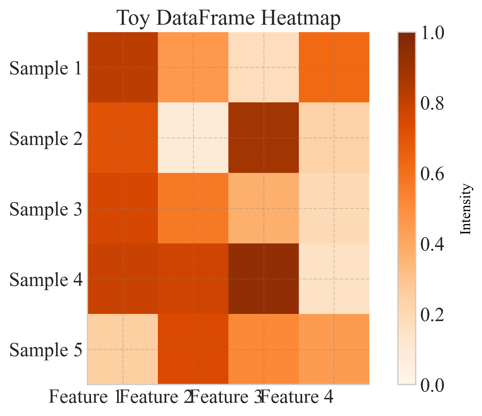
heatmap
Plot a heatmap of any pandas DataFrame with optional axis labels, annotations, and custom color-scaling.
multiple_std_lines_df
Line plot with shaded confidence intervals and configurable label, color, and linestyle mappings, using a pandas DataFrame in long format.
general_bar_plot
General bar plot comparing multiple metrics for each category with consistent colors, hatching, and customizable font sizes.
dual_histogram_with_errorbars_df
Plot main model and baseline histograms with mean frequencies and standard error bars, using a pandas DataFrame in long format.
embedding_2d_plot
Plot a 2D embedding (e.g., t-SNE, PCA, UMAP) colored by categorical groups or continuous values, with optional density contours, legends, and colorbars.
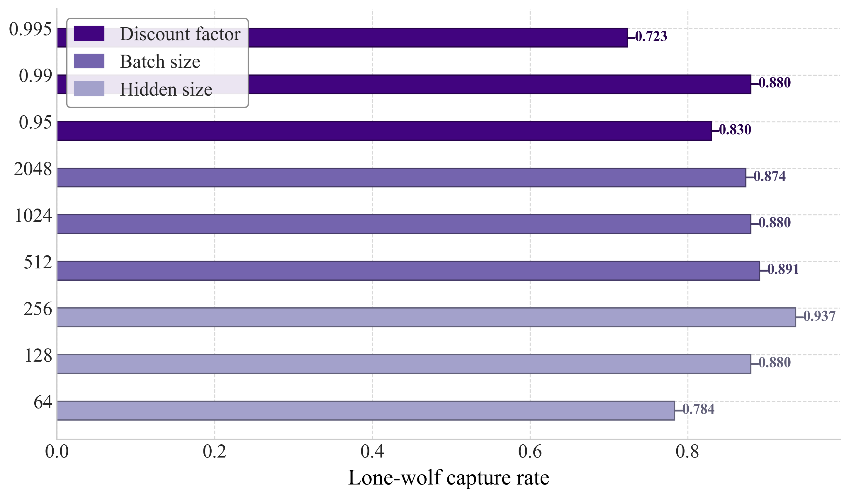
general_horizontal_bar_plot
Horizontal bar plot comparing metrics for each category, with optional group-based coloring and legends.
function_percentile_plot
Plot any function curve across x-values, grouped by a variable (e.g., scale), with percentile annotations and optional formula text, with customizable font sizes.
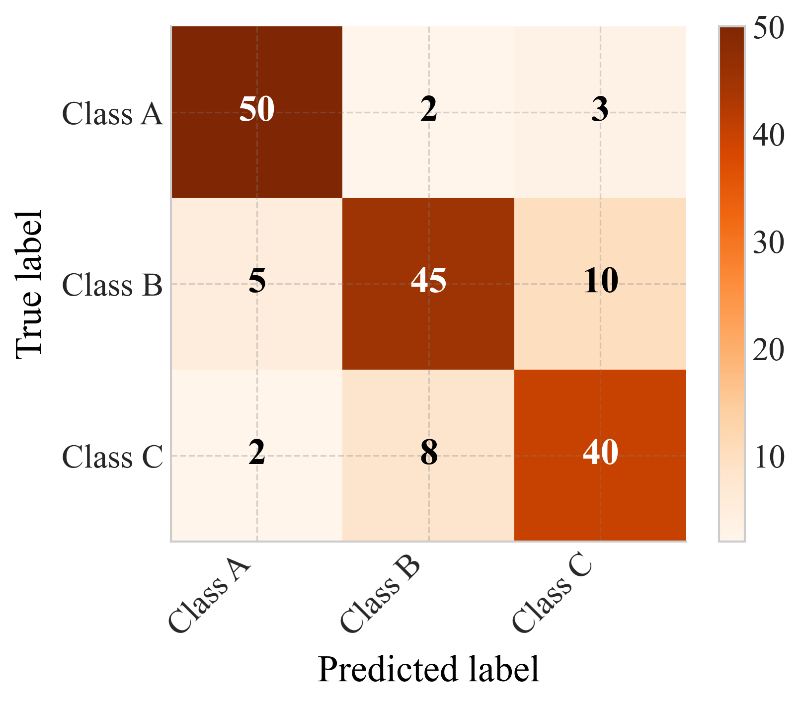
confusion_matrix
Plot a confusion matrix heatmap with optional normalization and annotations.